 Written by
 I once watched a young chef, bright-eyed and brimming with culinary ambition, present me with a menu that looked more like a literary anthology than a way to feed people. He had thirty-two items, ranging from delicate emulsions to slow-braised meats, and he genuinely believed this was the secret to success. He thought he was offering “choice,” but all he was actually doing was building a financial suicide note. Most consultants will sell you a “complete guide to menu design” that focuses on font sizes, color psychology, or how to hide the dollar signs, but they never tell you that a bloated menu is just a polite way of saying you’re about to drown in food waste and staff burnout.
I’m not here to talk about which shade of cream makes a scallop look more expensive. I’ve spent thirty-eight years learning that a menu is a mathematical blueprint for your survival, not a poem. In this guide, I’m going to strip away the fluff and tell you how to build a list that actually works—one that respects your kitchen’s limits, protects your margins, and ensures you aren’t throwing money in the bin every time a prep cook over-orders a garnish you only use twice a week.
Menu Engineering Techniques That Save Your Bottom Line
When people talk about menu engineering techniques, they usually treat it like a magic trick—something you do to trick a customer into buying the expensive sea bass. That’s nonsense. In my experience, it’s actually about guiding the eye so the guest doesn’t feel overwhelmed by choice. If your menu is a wall of text, they’ll panic and order the safest, lowest-margin thing on the list—usually a burger or a pasta. You need to use visual hierarchy to create a path. I always told my servers: if the guest has to squint, you’ve already lost the sale. Use white space like it’s a precious ingredient; a cluttered page feels cheap, and a cheap feeling leads to cheap tips and even cheaper perceptions of your food.
It isn’t just about where you place the steak, either. It’s the subtle math of restaurant profitability through design. I’m talking about the way a slightly larger font or a well-placed box can draw attention to that one dish with a high margin and a low prep time—the dish that keeps your kitchen sane during a Friday rush. Don’t get distracted by fancy color theory or chasing trends; if the font is too small or the colors are too loud, you aren’t designing a menu, you’re designing a headache.
Visual Hierarchy in Menus Directing the Eye and the Wallet
Most people think a menu is just a list of what’s in the larder, but it’s actually a map. If you just list your items in a straight, boring column from top to bottom, you’re leaving money on the table. You need to understand visual hierarchy in menus if you want to guide a guest toward the dishes that actually keep your lights on. I always looked for the “sweet spot”—that upper right-hand corner where the eye naturally lands after a moment of scanning. That’s where your high-margin signature dish belongs, not your most expensive steak that eats up your entire food cost percentage.
Don’t fall into the trap of using fancy, swirling scripts that make your customers squint; font selection for readability is a matter of hospitality, not just aesthetics. If they can’t read the description, they’ll just order the first thing they recognize, which is usually the cheapest thing on the page. Use subtle cues—a bit of extra white space or a simple box around a section—to signal importance. You aren’t trying to trick them; you’re just making it easier for them to find the food you’re most proud of making.
The Practical Math of the Printed Page: Five Rules for Not Bleeding Money
- Stop treating your menu like a grocery list; if a dish doesn’t have a clear reason to exist—either because it uses a high-margin ingredient or it’s a signature that brings people through the door—cut it. Every extra item is just another piece of inventory sitting in your fridge, losing value every hour it isn’t sold.
- Watch your descriptions like a hawk, but keep them honest. If you use “locally sourced” or “hand-crafted” for every single item on the page, you’ve made those words meaningless, and your customers will smell the laziness. Use specific details that justify a higher price point, like the name of the farm or the specific way a sauce is prepared, rather than hiding behind empty adjectives.
- The “Golden Triangle” isn’t just a theory; it’s how people actually read when they’re hungry and slightly distracted. Place your high-margin, high-profit items where the eye naturally lands—usually the center or the top right—but don’t be so heavy-handed that it looks like a trap. A guest who feels manipulated won’t come back for a second visit.
- Beware the “Price Column” temptation. If you line up your prices in a neat vertical column on the right-hand side, you are essentially inviting your guests to play a game of “find the cheapest number.” Instead, tuck the price at the end of the description without a dollar sign or a trailing line of dots; it keeps the focus on the food rather than the math.
- Design for the reality of your service, not the dream of your kitchen. If your menu is too complex for your staff to describe comfortably during a busy Friday rush, or if it requires too much “assembly” during service, your quality will tank. A menu should be a roadmap that your servers can navigate with confidence, not a puzzle they have to solve while a table waits.
The Hard Truths Behind the Page
A menu isn’t a laundry list of everything you know how to cook; it’s a controlled list of what you can afford to do perfectly every single night without breaking your staff or your bank balance.
Stop hiding your high-margin stars behind flowery adjectives and expensive fonts; if a dish is your lifeline, make sure the guest sees it without having to hunt for it.
Every extra item you add to that list is a hidden tax on your kitchen’s sanity, increasing your waste, your prep time, and the likelihood that someone is going to walk out with a half-finished plate.
The Myth of Choice
A menu isn’t a grocery list or a way to show off how many ingredients you can source; it’s a controlled environment. If you give a customer twenty choices, you aren’t being generous—you’re being indecisive, and you’re forcing your kitchen to carry the weight of twenty different prep lists, twenty different waste risks, and a staff that’s spread too thin to actually care about the plate in front of them.
Rosalind Achterberg
The Bottom Line is More Than Just Numbers
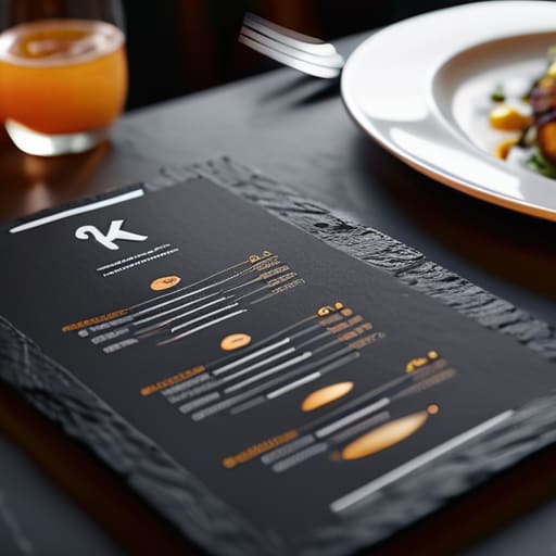
At the end of the day, a menu isn’t a piece of art for a gallery; it is your most important salesperson. You’ve learned how to engineer your margins, how to guide a guest’s eye away from the cheap filler and toward the dishes that actually pay the rent, and how to keep your kitchen from collapsing under the weight of too much choice. If you get the visual hierarchy right and the math behind your pricing stays honest, you aren’t just feeding people—you are building a sustainable business model that can survive a bad month or a broken oven. Don’t let the aesthetics fool you; every word on that page has a job to do, and if it isn’t making your life easier or your bank balance healthier, it shouldn’t be there.
Running a restaurant is an exhausting, beautiful, and often heartbreaking gamble, but a well-designed menu is one of the few things you can actually control. It is the bridge between your passion in the kitchen and the reality of your overheads. When you finally sit down at the end of a long service, you shouldn’t be wondering if you made enough to cover the staff and the electric; you should know exactly how that menu worked for you. Design with intention, price with courage, and remember that a smart menu is what keeps the lights on long enough for you to do what you love: serving incredible food.
Frequently Asked Questions
If I'm running a tiny room with only one chef, how do I balance a menu that looks impressive without accidentally killing my kitchen staff by Wednesday?
You have to stop thinking about “variety” and start thinking about “cross-utilization.” If your chef has to prep fifteen different garnishes for six different proteins, they’ll be staring at a wall by Wednesday. The trick is to pick five high-quality components that can dance in three different ways. A single, perfectly roasted seasonal vegetable can be a side, a base for a vegetarian main, or a component in a salad. Build depth, not breadth.
How much should I actually be charging for wine and cocktails on the menu to cover the hidden costs of breakage and staff training?
You aren’t just pricing a liquid; you’re pricing the glass it’s in, the training to pour it, and the inevitable moment a busboy trips. If your cocktail is £12, you’re likely losing money. You need to bake in a “chaos tax.” I always looked for a 3x to 4x markup on spirits to cover the breakage and the time it takes to teach a kid how to actually use a jigger without spilling half the bottle.
When does a "special" or a seasonal addition stop being a way to move stock and start becoming a logistical nightmare for my prep list?
It stops being a “special” the moment you have to order a unique ingredient that only serves one dish. If that seasonal truffle or specific heirloom tomato isn’t pulling its weight across at least three different components of your prep list, you aren’t being creative; you’re being expensive. A special should be a way to use what you already have in a new light, not a way to invite a new, tiny, high-risk invoice into your kitchen every Tuesday.
