 Written by
 Most people approach a menu like they’re reading a list of wishes, scanning for the most expensive protein or the trendiest ingredient as if that’s the secret to a good meal. They think “fine dining” means a sprawling, twenty-page tome of possibilities, but I’ve spent thirty-eight years learning that a massive menu is usually just a sign of a kitchen in panic. When I ran my own sixteen-seat room, a long menu meant I was over-ordering stock, wasting labor, and praying nothing went off before Friday. If you want to know how to read a menu properly, you have to stop looking at what they’re offering and start looking at what they’re trying to hide.
I’m not here to teach you about flavor profiles or how to pair a Pinot with sea bass; you can find that in a glossy magazine. Instead, I’m going to show you how to spot the difference between a chef with a vision and a manager with a high food cost. I’ll teach you to read the architecture of the page to see the real constraints—the staffing, the prep time, and the actual quality of the ingredients. By the time we’re done, you’ll see a menu for what it truly is: a business document that happens to be delicious.
Decoding the Silent Language of Menu Pricing Strategies
When you look at a menu, don’t just look at the numbers; look at what they’re trying to hide. Most people think a price is just a price, but in the world of menu pricing strategies, those digits are carefully placed tools. You’ll often see a ridiculously expensive turbot or a wagyu ribeye sitting right at the top of the list. It’s not always because they want you to order it; it’s there to make the thirty-pound sea bass below it look like a reasonable bargain. It’s a psychological anchor, and once you see it, you can’t unsee it.
Then there is the matter of the currency symbol. If you see a menu that lists prices as “24” instead of “£24.00,” pay attention. By stripping away the pound sign, the restaurant is attempting to sever the mental link between the food and the actual cost. They want you focused on the flavor, not the dent in your bank account. It’s a subtle bit of restaurant menu psychology designed to make the transaction feel less like a loss and more like an experience. I used to do it myself, usually when I was trying to mask a slightly rising food cost without having to explain it to the regulars.
Understanding Menu Layout and the Art of Distraction
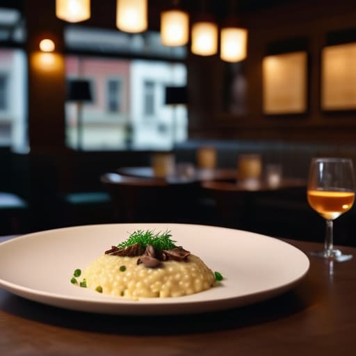
When you sit down, your eyes naturally gravitate toward the center of the page or the top right corner. This isn’t an accident; it’s restaurant menu psychology in its purest, most calculated form. Designers know exactly where your gaze will land first, and that is precisely where they’ll tuck the dish with the highest profit margin—usually something with low food cost like pasta or risotto, but dressed up with fancy adjectives to justify a premium price. They aren’t just presenting food; they are directing traffic.
I used to watch my own servers notice how guests would skip over the “anchor” items—those outrageously expensive steaks or seafood platters placed at the top—only to feel like they were getting a bargain on the £35 entree listed just below them. That’s the trick. By providing a high-priced outlier, the restaurant makes everything else look reasonable. If you want to truly master understanding menu layout, stop looking for what looks delicious and start looking for what the kitchen is trying to sell you. The most expensive item on the page is often just a decoy.
The Realities Hidden Between the Lines
- Look for the “anchor” dishes—those ridiculously expensive items placed at the top. They aren’t there to be sold; they are there to make the twenty-eight-pound sea bass look like a reasonable bargain by comparison.
- Pay attention to the ingredient list’s length; if a dish is described with a laundry list of twelve adjectives and five origins, the kitchen is likely trying to distract you from the fact that the primary protein is mediocre.
- Check the consistency of the pricing format. If one dish has a currency symbol and another doesn’t, or if they are all neatly aligned in a column on the right, they are using psychological tricks to make you focus on the food rather than the math.
- Count the number of items in each category. A massive list of mains is a red flag for a kitchen that is over-ordering and likely using frozen or pre-prepared components to keep up with the demand.
- Watch for the “specialty” items that appear on every menu in every town; if the menu is too safe, it means the chef is playing it too close to the vest to avoid the financial risk of a wasted ingredient, which usually means the meal will be forgettable.
The Three Things You Should Actually Be Looking For
Watch the ingredient list for “hero” items versus filler; if a dish lists a premium protein but follows it with three different types of heavy starch, the kitchen is likely trying to pad the plate to hide a small portion size.
Pay attention to the seasonal shifts in the menu descriptions; a chef who changes their offerings based on what’s actually coming off the truck is a chef who understands their margins and their quality, whereas a static, massive menu is usually a sign of a kitchen stuck in a cycle of frozen prep and wasted labor.
Look for the “anchor” dishes—those ridiculously expensive items placed at the top—not because you should order them, but because they are there to make the mid-priced specials look like a sensible bargain to your brain.
The Truth Between the Lines
Stop looking for what you want and start looking for what the kitchen is afraid to lose; a menu isn’t just a list of food, it’s a map of a chef’s margins, their prep list, and exactly how much risk they’re willing to take on a Tuesday night.
Rosalind Achterberg
The Last Bite
At the end of the day, reading a menu isn’t about playing detective or trying to outsmart a clever proprietor; it’s about understanding the negotiation happening between the kitchen and the dining room. When you look past the fancy fonts and the clever layout, you start to see the reality of the operation. You see why they’ve priced that sea bass the way they have to cover the rising cost of fuel, and you recognize when a limited selection is actually a sign of a kitchen that cares deeply about ingredient integrity rather than just being lazy. Once you stop seeing a menu as a mere list of options and start seeing it as a business’s daily blueprint, you stop being just a customer and start becoming a guest who truly understands the room.
So, the next time you sit down and that heavy, cardstock menu is placed in front of you, don’t just rush to the bottom line. Take a breath. Look at the architecture of the page, consider the constraints of the season, and remember that every dish represents a series of hard choices made by people who are likely exhausted and working very hard to make your evening perfect. If you can approach your meal with that bit of informed empathy, you’ll find that the food almost always tastes better. After all, the best dining experiences aren’t just about what is on the plate, but about the quiet respect you hold for the work that put it there.
Frequently Asked Questions
If the menu is designed to distract me, how can I tell which dishes are actually the kitchen's specialty and which are just there to pad out the margins?
Look for the “anchor” dishes—the ones that sound a bit too ambitious or use ingredients that require a specific, skilled hand. If a dish features a technique that’s hard to fake, like a perfectly emulsified sauce or a slow-braised cut that takes twelve hours, that’s the kitchen’s pride. The margin-padders are usually the “safe” bets: pasta, risotto, or chicken breasts. If it looks like something they could prep in bulk and reheat, steer clear.
Why does it matter if a place has a massive, multi-page menu versus a single sheet, and what does that tell me about their actual food quality?
A massive, leather-bound menu is usually a red flag. It tells me they’re trying to hide a lack of focus behind sheer volume. When you have fifty items, you can’t possibly source everything fresh, which means half that list is sitting in a freezer. A single sheet? That’s a kitchen with confidence. It means they know exactly what’s good today, they aren’t wasting money on excess stock, and they actually know their suppliers.
When I see a lot of "chef's signatures" or overly descriptive language, is that a sign of talent or just a way to justify a higher price point?
It’s usually the latter, though not always. When you see a paragraph describing “hand-foraged heirloom micro-greens,” it’s often a smokescreen for a high food cost or a way to make a simple plate feel like an event. If the description is long, they’re selling you a story because the ingredients alone aren’t doing the heavy lifting. A truly talented chef lets the product speak; they don’t need a thesaurus to justify the bill.
