 Written by
 I once watched a young, ambitious owner spend forty thousand pounds on custom-made velvet banquettes and hand-blown glass pendants, only to realize he’d designed a beautiful tomb. He was so obsessed with the “look” of his dining room that he forgot to ask how to design a restaurant layout that actually moves. By the time the third week of service hit, his servers were colliding in the narrow gaps between tables, his kitchen pass was a bottleneck of shouting, and his guests were staring at the back of each other’s heads. Most design consultants will sell you a dream of aesthetic perfection, but they rarely mention that if your floor plan doesn’t account for the physical friction of a working service, you aren’t building a restaurant—you’re building a disaster.
I’m not here to talk to you about color palettes or the latest lighting trends. I want to talk about the unseen mechanics of a profitable room. I’m going to show you how to map out a space that protects your margins, respects your staff’s tired feet, and ensures your guests feel tucked away rather than squeezed in. This is about the math and the movement behind the menu.
The Invisible Leak Restaurant Floor Plan Optimization
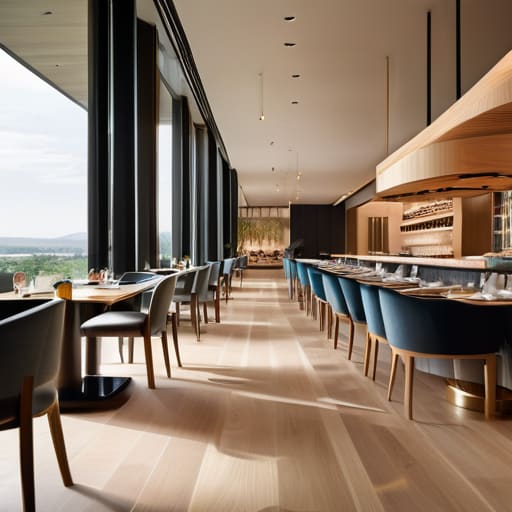
You can have the most exquisite menu in the city, but if your floor plan is a mess, you’re essentially pouring money down the drain. I’ve seen so many young owners fall into the trap of chasing dining area seating capacity like it’s a high score in a video game. They cram in extra four-tops to boost the projected covers, but they forget that a crowded room creates friction. When your waiters are constantly shoulder-checking guests or tripping over chairs, the atmosphere dies, and your staff starts looking for the exit.
True restaurant floor plan optimization isn’t about how many bodies you can fit; it’s about the invisible geometry of movement. You have to map out the path from the pass to the furthest table. If your service station placement forces a runner to trek through a narrow bottleneck every time a side of salt is needed, you’ve just built a tax on your own labor. Every unnecessary step a staff member takes is a second they aren’t spending on a guest—and in this business, time is the only thing you can’t buy back.
Trading Seats for Sanity Dining Area Seating Capacity
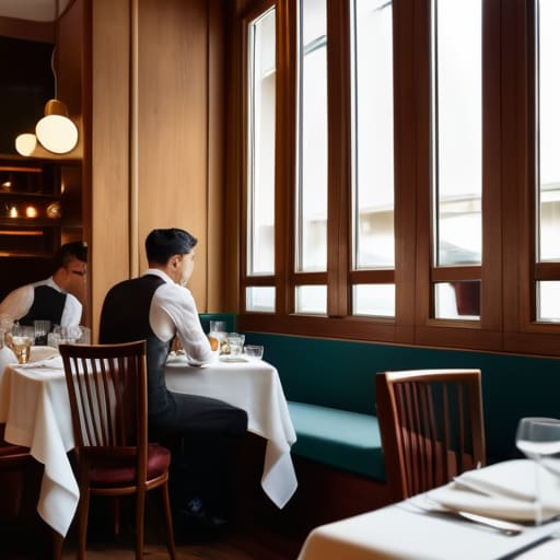
Every new owner I’ve met comes to me with the same fever: they want to squeeze one more table into that corner, convinced that more chairs equals more revenue. They see a gap between two booths and think, there’s a four-top waiting to happen. But they aren’t accounting for the physical cost of that extra seat. When you push your dining area seating capacity to the absolute limit, you aren’t just crowding the guests; you are strangling your staff. I spent twenty-six years learning that a room feels “full” when it’s buzzing, but it feels “claustrophobic” when a waiter has to turn sideways just to reach a water carafe.
If you ignore customer traffic patterns in favor of a higher cover count, you’ll pay for it in broken glassware and burnt steaks. A cramped floor plan turns a smooth service into a chaotic scramble, making it impossible for a server to navigate without bumping into a guest’s chair. You have to decide: do you want a room that looks busy on paper, or a room that actually functions? I’d rather have twelve happy guests and a staff that can breathe than sixteen miserable ones and a team on the verge of quitting.
The Practical Math of the Floor: Five Hard Truths About Your Layout
- Respect the Kitchen’s Breathing Room. I’ve seen owners try to shave six inches off a prep station to squeeze in one more table, and it’s a disaster waiting to happen. If your chefs are tripping over each other or have to take three steps just to reach the pass, your ticket times will climb, your staff will quit, and your food will arrive lukewarm. A cramped kitchen isn’t a space-saver; it’s a bottleneck that costs you money every time a plate sits under a heat lamp for too long.
- The Service Path is a Highway, Not a Sidewalk. You need to map out the exact route from the kitchen to the furthest table before you bolt a single chair to the floor. If your servers have to weave through a labyrinth of high-backed booths or navigate a narrow gap between a host stand and a dining table, they’re going to spill drinks, bump guests, and burn out by week three. A layout that prioritizes guest “ambiance” over server “flow” is just a fancy way of sabotaging your service.
- Don’t Forget the “Dead Zones” in Your POS Placement. It sounds trivial until you’re in the weeds at 8:00 PM on a Saturday. If your service station or your point-of-sale terminal is tucked into a corner where a waiter has to walk twenty paces just to enter an order, you’ve lost the rhythm of the room. Your staff needs to be able to pivot, glance at the floor, and hit a button without feeling like they’re embarking on a trek.
- The Bathroom Audit. I don’t care how beautiful your velvet banquettes are; if your restroom door opens directly onto the dining room or if the path to the toilets feels like a gauntlet of staring eyes, the guest experience is broken. There is a psychological cost to being “on display” while walking to the loo, and it’s a cost that shows up in your reviews and your repeat business.
- The Lighting and Acoustic Trap. A layout isn’t just about where the furniture sits; it’s about how the space feels when it’s full. If you design a room with too many hard, flat surfaces—think polished concrete and glass—you’ll create an echo chamber where guests have to shout to be heard. Once people start raising their voices to compete with the noise, the energy of the room shifts from “vibrant” to “exhausting,” and they won’t come back for a second round of drinks.
The Hard Truths of the Floor Plan
Stop chasing “covers” at the expense of flow; a room packed with too many tables creates a bottleneck that slows down service, burns out your floor staff, and makes your guests feel like they’re dining in a crowded hallway rather than a restaurant.
Design for the “invisible” movements, not just the guest experience; if your servers have to weave a marathon course between the kitchen pass and the dining room just to deliver a side of salt, you are bleeding profit through wasted steps and delayed service.
Every square foot must earn its keep, but don’t confuse density with revenue; a well-spaced layout that allows for a smooth, professional service will always out-earn a cramped room where the chaos prevents guests from ordering that second bottle of wine.
The Illusion of the Extra Table
Don’t fall in love with a floor plan that looks good on a blueprint but kills your service; if you squeeze one more table into that corner just to chase a higher cover count, you aren’t increasing your profit—you’re just paying for the privilege of watching your staff burn out and your guests feel like they’re eating in a hallway.
Rosalind Achterberg
The Bottom Line on Your Floor Plan
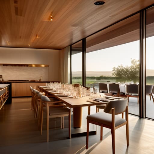
At the end of the day, a floor plan isn’t just a blueprint; it’s a mathematical equation that determines whether you’ll be able to pay your staff on Friday. You’ve looked at the flow of the kitchen, the math of your seating capacity, and the delicate balance between maximizing covers and maintaining a room where people actually want to linger. If you try to cheat the geometry by cramming in an extra table that blocks the server’s path to the pass, you aren’t gaining profit—you’re buying yourself a headache and a slower table turnover. Remember that every inch of your dining room must serve a dual purpose: it has to feel comfortable for the guest and economically viable for the person running the books.
Designing a restaurant is an act of controlled chaos, and no matter how perfect your CAD drawing looks, the real test happens when the printer starts screaming during a Friday night rush. Don’t let the pursuit of a “perfect” aesthetic blind you to the practical realities of the service. Build a space that respects the sweat of your kitchen crew and the patience of your guests, and you might just find that the layout becomes your greatest silent partner. A well-designed room doesn’t just hold people; it holds the rhythm of your business together, allowing you to focus on what actually matters—the food, the wine, and the people sitting across from you.
Frequently Asked Questions
How do I balance the need for more covers with the reality that a cramped room will eventually kill my service speed and my staff's morale?
You have to stop looking at your floor plan as a math problem and start looking at it as a circulatory system. If you choke the arteries—the paths between the kitchen and the tables—the whole body fails. You might squeeze in four extra covers, but if your waiter is constantly bumping into guests or tripping over a busboy, your table turn slows down and your service quality tanks. A cramped room doesn’t just kill speed; it kills the joy of the job. And once your staff stops enjoying the shift, you’ve already lost.
At what point does a "smart" layout become a logistical nightmare for the kitchen pass and the runners?
It happens the moment you prioritize a “chic” floor plan over a straight line. If a runner has to dodge a decorative pillar, weave around a cocktail trolley, or play a game of Tetris just to reach the pass, you’ve already lost. A smart layout respects the physics of a hot plate. The second your staff starts apologizing for the architecture instead of focusing on the guest, your “design” has become a liability.
How much of my floor plan should be dedicated to the "vibe" versus the actual, unglamorous movement of people and plates?
You can’t eat a vibe, and your staff certainly can’t carry a heavy tray of glassware through a “moody” bottleneck. If you sacrifice too much space to atmosphere, you’re just paying rent on empty air. I always tell people: aim for 60/40. Give the guests the feeling they came for, but give the plates and the people the room they need to move without a collision. A beautiful room that feels frantic is just a pretty disaster.
