 Written by
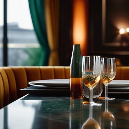
 I’ve sat through enough “concept dinners” to know that you can spend fifty thousand pounds on hand-blown glass pendants and reclaimed oak flooring, but if the acoustics are so sharp that guests have to shout over their sea bass, you haven’t created an atmosphere—you’ve created a battlefield. I see it all the time: designers obsessing over the Instagrammability of a velvet banquette while completely ignoring how restaurant interior design affects mood in a practical, human sense. You can have the most beautiful room in the city, but if the lighting makes a guest feel like they’re under interrogation, or if the chair height makes them feel awkward and exposed, they aren’t going to linger. And if they don’t linger, they aren’t ordering that second bottle of wine.
I’m not here to talk to you about color theory or the “spiritual essence” of a dining space. I’m here to tell you how the physical reality of your room dictates your bottom line. I want to show you why a well-placed service station matters more than a statement mural, and how to design a space that actually works for your staff and your guests alike. This is about the hard truth of hospitality: making sure the room serves the food, rather than getting in its way.
The Psychology of Restaurant Lighting and Profitability
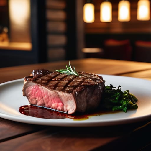
You can spend forty thousand pounds on hand-blown glass pendants and designer Edison bulbs, but if you haven’t calculated the actual psychology of restaurant lighting, you’re just burning money. I’ve seen too many young owners try to create “atmosphere” by dimming everything until the guests are squinting at their menus like they’re trying to decode ancient hieroglyphs. If a customer can’t see the sear on that expensive ribeye, they aren’t going to appreciate the chef’s technique; they’re just going to feel frustrated.
The real trick isn’t just about brightness; it’s about control. You want light that pools over the table to create intimacy, but you need enough clarity so the staff can actually see the plates they’re carrying. High-contrast lighting can make a room feel expensive, but if it’s too harsh, it triggers a subconscious desire to leave. You have to balance the warmth that encourages a second bottle of red with enough visual comfort that the guest doesn’t feel like they’re dining in a cave. At the end of the day, light is a tool for managing the pace of the meal, and if you use it wrong, your table turnover will suffer.
Color Theory in Dining Environments Painting the Bottom Line
Most owners think picking a paint color is about whether they like sage green or navy blue, but they forget that color theory in dining environments is actually a tool for managing turnover. If you want a high-volume bistro where people eat, enjoy, and clear the seat for the next booking, you don’t paint the walls in soft, drowsy pastels. You use colors that stimulate the appetite and keep the energy moving. I’ve seen too many young restaurateurs try to create a “sanctuary” with muted creams and greys, only to find their tables sitting for three hours over a single espresso while the waiting list is out the door.
On the flip side, if you’re running a high-end tasting menu where the price point demands a slow, deliberate pace, you need to lean into the sensory design in hospitality that encourages lingering. Deep, saturated tones—think burgundy or forest green—create a sense of enclosure and intimacy. These colors tell the guest they are safe to stay, which is exactly when they stop looking at the clock and start looking at the wine list. You aren’t just decorating; you are subtly directing the flow of cash.
Five Design Choices That Either Keep Your Chairs Full or Send People Running for the Exit
- Stop treating your floor plan like a jigsaw puzzle. You might love the look of those tight, trendy bistro tables, but if your servers are playing a game of Tetris just to get a plate of sea bass to table four without clipping a shoulder, your service will suffer. A cramped room doesn’t feel “intimate”—it feels frantic, and guests can smell that anxiety from the door.
- Acoustic management is not an optional luxury; it is a fundamental part of your overhead. You can spend fifty thousand on custom marble counters, but if the room echoes like a gymnasium, nobody is going to stay for that second bottle of Burgundy. If they can’t hear their partner without shouting, they’ll finish their meal in a hurry and never come back.
- The “Dead Zone” check. Every restaurant has that one table that sits in a draft by the kitchen door or right next to the restroom corridor. I spent three years trying to “make it work” before realizing that no amount of clever menu writing can compensate for a seat that makes a guest feel like they’re sitting in a hallway. If a table is uncomfortable, stop trying to sell it and just take it out of the rotation.
- Furniture that looks good in a catalogue often fails the “long dinner” test. If you want people to order dessert and coffee—which, let’s be honest, is where your real margin lies—they need a chair that supports them. If they’re constantly shifting their weight or trying to balance a wine glass on a wobbly pedestal, they’ll be out the door the second they swallow their last bite of main.
- Don’t neglect the staff’s “invisible” geography. I’ve seen too many beautiful dining rooms where the designers forgot that the staff needs a place to breathe, a place to rest a heavy tray, and a path to the kitchen that doesn’t involve a collision course with a guest. A room that is designed only for the guest’s eyes, and not the staff’s feet, is a room that will eventually break your team.
The Bottom Line of the Room
At the end of the day, your dining room isn’t just a collection of aesthetic choices; it is a functional machine that dictates how fast people eat, how much they drink, and how much they tip. You can argue about whether a shade of sage is more “on-trend” than a deep navy, but if your lighting makes the menu unreadable or your floor plan creates a bottleneck at the service station, you aren’t designing a space—you’re designing a logistical nightmare. Every chair, every bulb, and every splash of color has a direct line to your P&L statement. If the environment makes the guests feel rushed or the staff feel cramped, no amount of clever plating will save your margins.
If you take anything away from this, let it be that a beautiful room is useless if it doesn’t serve the people inside it. Design should be the invisible hand that guides a guest toward a second bottle of wine and a feeling of being truly looked after, while simultaneously allowing your team to move with grace. Don’t build a museum that people are afraid to touch; build a home for your hospitality where the bones are strong and the atmosphere is intentional. A well-designed room doesn’t just look good on Instagram—it keeps the doors open for another season.
Then there is the matter of the floor plan, which is where most young owners lose their shirts before the first course is even served. You can spend a fortune on bespoke oak tables, but if your layout creates a bottleneck between the kitchen pass and the restroom, your staff will be perpetually frazzled and your covers will suffer. I always tell people that flow is everything; if the waiter has to perform a choreographed dance just to reach a table of four, you aren’t just losing time, you’re losing the ability to turn that table efficiently. It’s about finding that sweet spot where the room feels intimate for the guest but remains a functional workspace for the people actually doing the heavy lifting.
